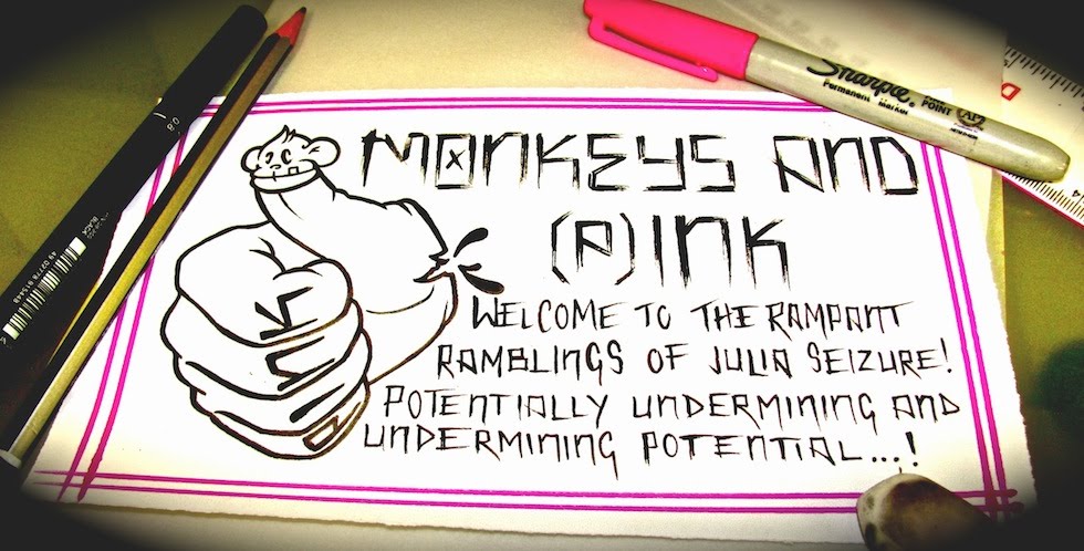
this one is the original colour scheme.... and i think i'm gonna go with this, coz i really like black red n white together.....

this was just me fuckin about with the colours, but i REALLY like it. i just dont think i would want my whole website like this.... shame.....

and lastly, i really like it in black n grey.... i'm torn, advise could help. suggestions anyone?


2 comments:
Definitely the first one
black n grey with red one a close 2nd
Post a Comment