last week we had a new ceiling installed, and in the next few weeks, we are having the shop fitted out with new walls, getting the floor fixed up a bit, and the studio is getting a pretty big revamp to boot! ooh, it's so exiting!
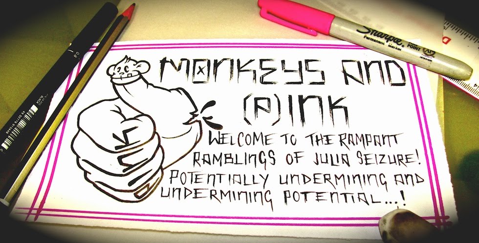
so to go along with the new shop, new sterilization room, and new studio, we are gonna have new signage, new t shirts, and maybe even revamp the website to match! so here's the design i've been working on for the hanging street sign (our old sign kept getting blown away during typhoons and it definately looks like it's had better days, so we dont have a sign on street level right now except for the one above the doorway.) i think that design will also double up as one of our new t shirt design...i'm guessin' white n red print on black....or maybe black n red with a thin white border.....i dunno, i'm thinkin' out loud now!
I'll get ross to fiddle around with it on photoshop and hopefully i can post some t shirt images soon. this isn't the final version for the sign (that's gonna be full colour) or the t shirt (there's gonna be a lot of black shading)but i got nothing to post before my day off 2morrow, so here's the scan of the design in question, enjoy!


1 comment:
sterilisation room?!? wooooooooot!
Post a Comment